In December, Pantone announced that they decided to choose not one, but two beautiful, complimentary pastels for their Color of the Year 2016: Rose Quartz and Serenity. The best part of this dynamic duo? These colors would look beautiful in any spring or summer wedding. That's why we're sharing inspiration, eye candy and tips on planning your wedding's color palette around Pantone's colors of the year in today's post. Happy planning!
Guidelines for Choosing Your Wedding Colors
First things first. Before we dive into rose quartz and serenity wedding inspiration goodness, let's talk about the steps you should take to establish a solid wedding color palette (besides expertly curating a Pinterest board, of course).

In general, there are three main factors to consider when picking your palette: season, setting and style. In our opinion, thinking seasonally is the most essential step towards choosing colors that you'll love. For instance, rose quartz and serenity work perfectly for spring and summer weddings, but they might not be as applicable to a fall wedding (where warmer earth tones tend to create a better mood). You should also be mindful of the setting: find inspiration in your venue and location, and try to choose colors that won't clash with the space. Take photos while visiting your venue, and Google previous weddings at that location to see what works and what doesn't. Luckily, we can see rose quartz and serenity working beautifully in quite a few scenarios—from a wedding on the beach to a rustic barn venue. Lastly, think about your personal style. Do you favor pastels or do see your wedding in bright, bold colors? You should have fun thinking about all the different color combinations—don't be afraid to break the rules and try something new! After all, it is your wedding, and your (and your fiancé's) personal style should be your first priority.
Completing Your Color Palette
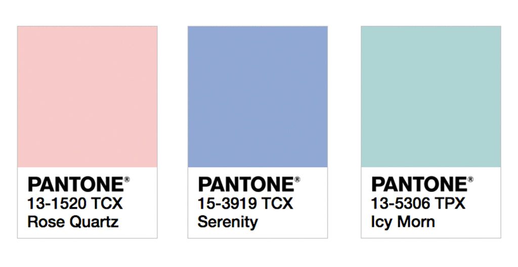
While rose quartz and serenity work well alone, it's a good rule of thumb to have at least three colors in your palette. This gives you a variety of options when it comes to picking out complimentary bridesmaid dresses, bouquets, table settings, etc. We decided to round out our wedding inspiration palette with a light, natural blue-green hue, also known as Pantone's "Icy Morn." The wedding we're envisioning has a spring outdoor setting, so our third color is inspired by those quiet, natural earth tones that remind us of springtime. Check out our finished palette swatches below:

**Tip** It's always helpful to head over to your local hardware store and pick out physical swatches for your palette. Don't have time for that? Pantone's color finder tool is a great way to find the exact hue you're looking for.
Get Inspired
Now that you've got your palette completed, you can let the planning begin! We've searched the web for our favorite rose quartz and serenity bridesmaid looks, accessories, decor and details. Feel free pin our image and check out our Pinterest for more wedding inspiration!

Sources (clockwise from left): 1. Kurt Boomer Photography/via Style Me Pretty 2. Peaches & Mint 3. Jose Villa Photography 4. Abby Capalbo/via Style Me Pretty 5. Brandon Kidd Photography/LVL Weddings & Events/via Bridal Guide 6. Sophie Stimpson/Two Little Cats Bakery/via Love My Dress 7. Blaine Siesser Photography/Vera Wang 8. Foxblossom Co. 9. Spindle Photography/Bella Bridesmaid Birmingham/via Style Me Pretty 10. Karli Noel Calligraphy/Ivy and Stone Photography


